Healthcare IT Data Visualization with Tableau: 1 Day Course, Melbourne
Schedule
Tue, 03 Mar, 2026 at 09:00 am to Sat, 08 Aug, 2026 at 05:00 pm
UTC+11:00Location
Regus 120 Collins Street | Melbourne, VI

About this Event
Bring your team and save:
1. Groups of three or more receive a 10% discount
2. Organizations hosting an in-house session with 10+ participants enjoy a 15% discount.
Duration: 1 Full Day (8 Hours)
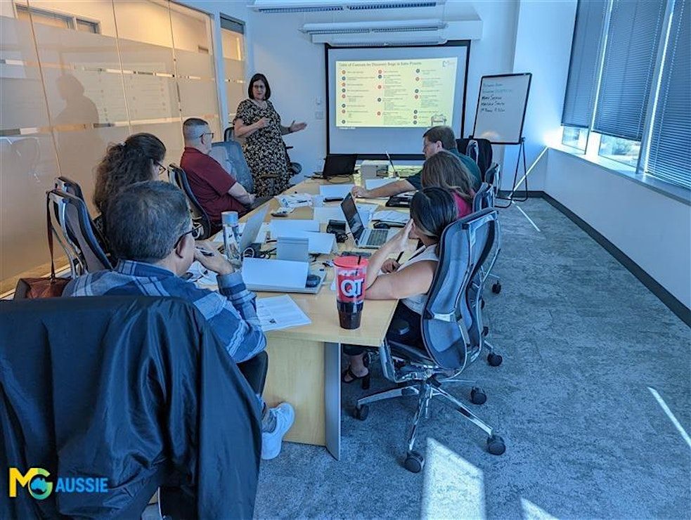
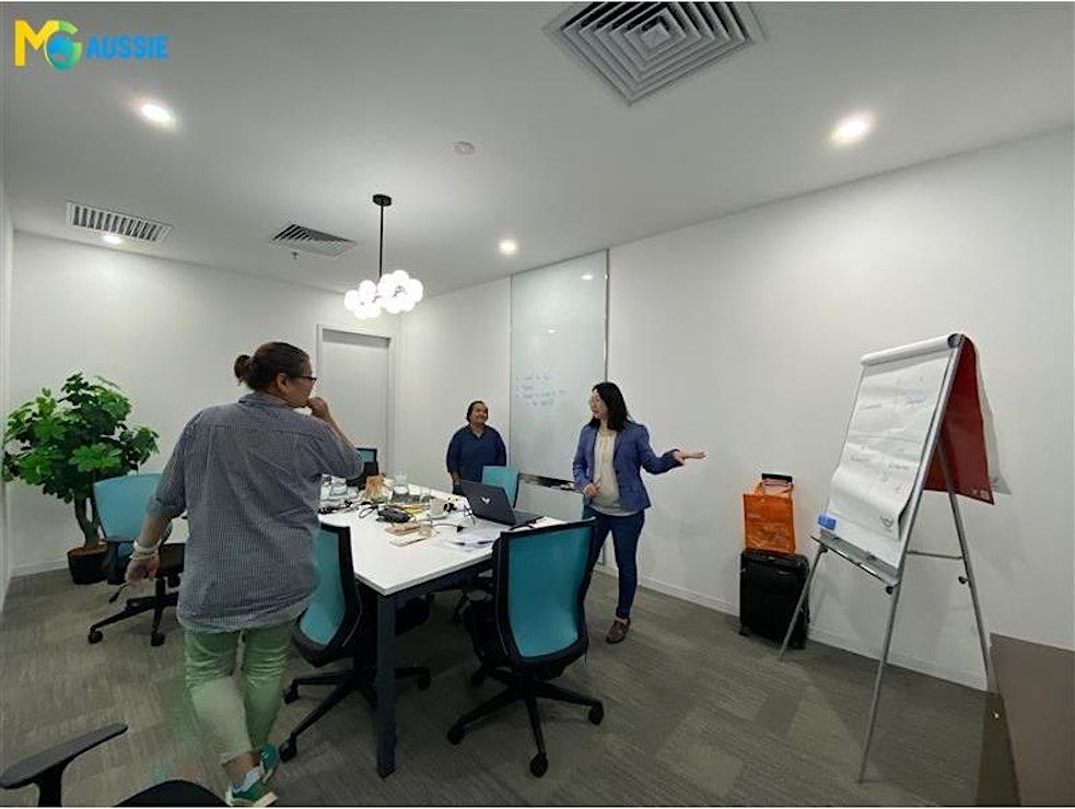
Delivery Mode: Classroom (In-Person)
Language: English
Credits: 8 PDUs/Training Hours
Certification: Course Completion Certificate
Refreshments: Lunch, Snacks and beverages will be provided during the session
Course Overview:
This intensive 1 Day program helps you understand healthcare data and transform it into meaningful visuals using Tableau. You explore healthcare KPI structures, essential data preparation, intermediate visualization techniques, calculated fields, LOD expressions, dashboard design, and storytelling. Each concept is simplified for beginners yet detailed enough for intermediate learners, ensuring you gain clarity, technical confidence, and the ability to present healthcare insights with impact.
Learning Objectives:
By the end of this course, you will be able to:
- Understand healthcare KPIs and choose the right metrics for dashboards.
- Prepare and model healthcare datasets for visualization.
- Build intermediate-level healthcare visuals in Tableau.
- Use calculated fields and simple LOD expressions.
- Design interactive, functional dashboards for healthcare reporting.
- Interpret insights from clinical, claims, and operational data.
- Present visual stories that support healthcare decisions.
Who can Attend?
- Healthcare data analysts
- BI & reporting teams
- Healthcare IT professionals
- Clinical informatics teams
- Students learning healthcare analytics
- Early-career data professionals
- Anyone shifting into visualization roles in healthcare
Why Choose this Course?
This course blends healthcare domain knowledge with Tableau visualization expertise, making complex data simple and actionable. The trainer brings real-world reporting experience and explains every concept in clear, practical language. With a structured foundation-to-intermediate flow, you gain the confidence to design dashboards that improve clinical and operational decision-making.
©2025 MG Aussie Events. This content is protected by copyright law. Copy or Reproduction without permission is prohibited.
Planning to upskill your entire reporting or analytics department?
We offer fully customizable in-house sessions tailored to your organization’s healthcare datasets, reporting requirements, and KPI structures. The course can incorporate your real metrics, data formats, and dashboard styles. This ensures your team builds consistent, accurate, and high-quality visualization skills across departments.
📧 Contact us today to schedule a customized in-house, face-to-face session:


Agenda
Module 1: Foundations of Healthcare Visualization
Info: • Role of visualization in healthcare decision-making
• Identifying key clinical and claims metrics
• Choosing effective visual formats for each KPI
• Icebreaker
Module 2: Preparing Healthcare Data for Tableau
Info: • Structuring datasets for clean analysis
• Data blending and relationship-building
• Handling inconsistencies in patient and claim fields
• Case Study
Module 3: Creating Healthcare Visuals in Tableau
Info: • Designing KPI charts: LOS, readmissions, claim trends
• Using dual-axis, heatmaps, and comparison visuals
• Highlighting outliers and critical patterns
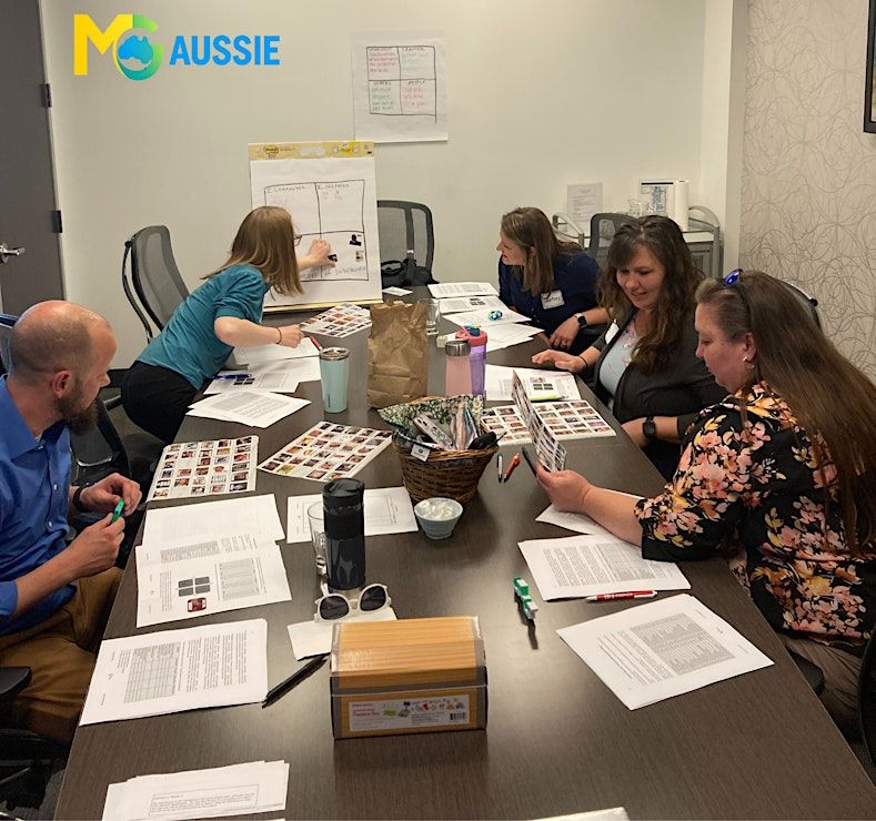
• Activity
Module 4: Calculated Fields & LOD Expressions (Intermediate)
Info: • Building derived metrics for healthcare insights
• Applying LOD expressions for patient or claim-level detail
• Creating logic-driven fields for deeper segmentation
• Brainstorm Activity
Module 5: Designing Interactive Dashboards
Info: • Structuring dashboards for clarity and usability
• Filters, parameters & guided user interactions
• Building cross-functional dashboards for reporting
• Simulation
Module 6: Storytelling with Healthcare Data
Info: • Turning dashboards into clear narratives
• Highlighting trends with clinical & operational context
• Presenting findings to different audiences
• Role Play
Module 7: Dashboard Evaluation & Reporting
Info: • Reviewing dashboard accuracy & consistency
• Optimizing layout performance
• Summarizing insights effectively
• Action Plan Review
Where is it happening?
Regus 120 Collins Street, 120 Collins Street #Levels 31 & 50, Melbourne, AustraliaEvent Location & Nearby Stays:
AUD 552.97 to AUD 720.27


![POKEMON Trivia at The Oxford Scholar Hotel [OXFORD]](https://cdn-ip.allevents.in/s/rs:fill:500:250/g:sm/sh:100/aHR0cHM6Ly9jZG4tYXouYWxsZXZlbnRzLmluL2V2ZW50czcvYmFubmVycy9hYThkYjhjZjFmYWEwYWJiZmVjYzExMTgxOGQ5MWI1NjFkMWNhYzE4NzgwMWRjODJjYjY3ZGVjNDg1MWRkMTgxLXJpbWctdzEwMjQtaDM3NC1kYzE3MTIxNC1nbWlyLmpwZz92PTE3NjY5MDA3NjU.avif)