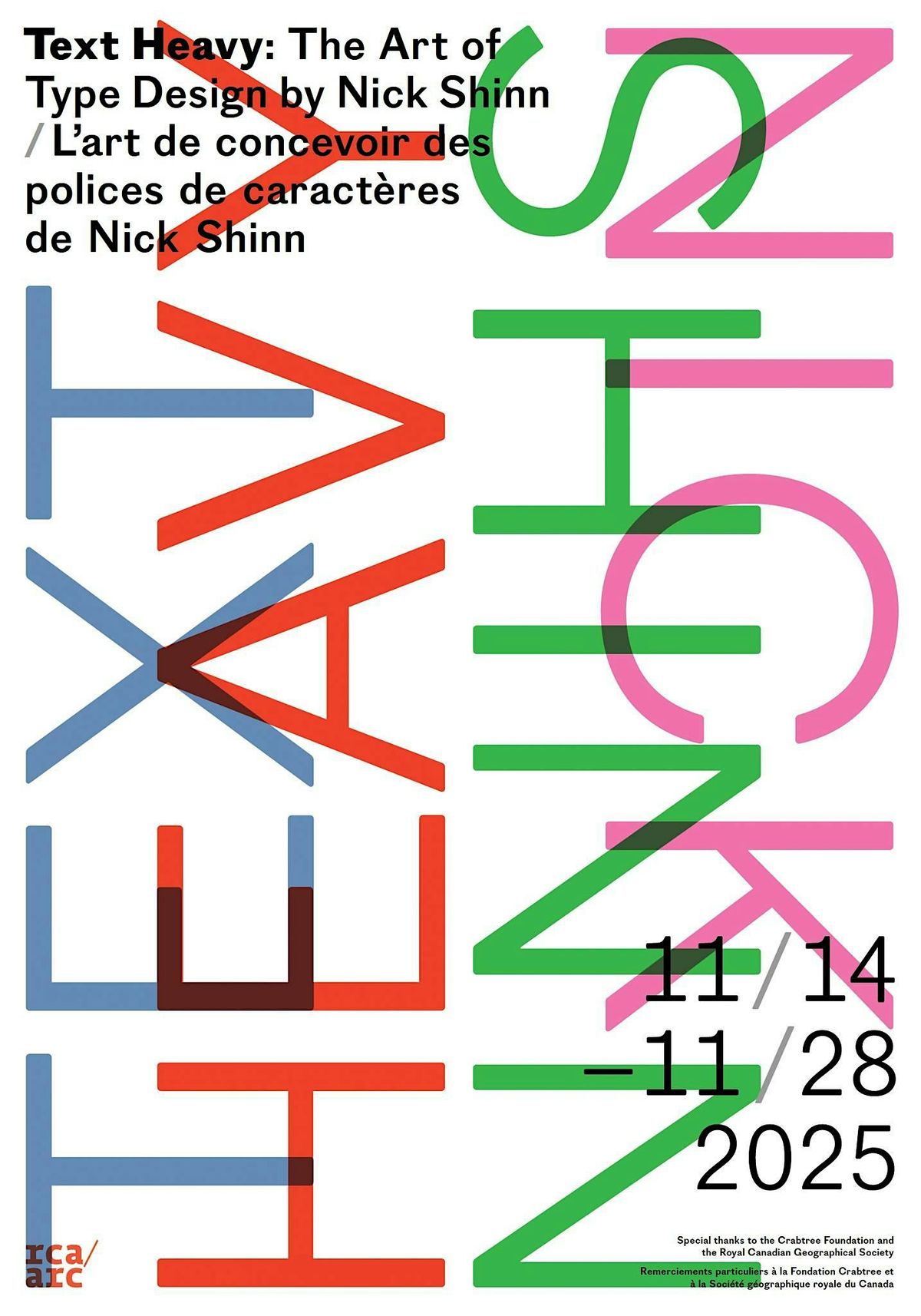
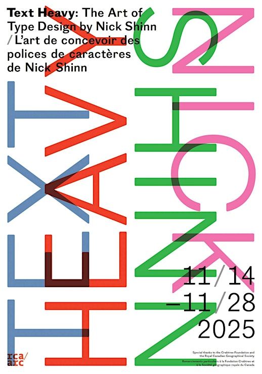
VERNISSAGE /OPENING: 'TEXT HEAVY: THE ART OF TYPE DESIGN BY NICK SHINN'
Schedule
Fri Nov 14 2025 at 07:00 pm to 09:00 pm
UTC-05:00Location
Royal Canadian Academy Of Arts | Ottawa, ON
About this Event
The Bleeding Edge
On the occasion of his induction into the Royal Canadian Academy of Arts, Nick Shinn says, “I didn’t want to become an artist.” Shinn, who cheerfully describes himself as a contrarian, says that when he was studying fine art at Leeds Polytechnic in the 1970s, so much of the art he saw being produced looked irrelevant, “new ways to say nothing.” Instead, Shinn wanted to use his time at school to hone a variety of skills, to build his capacity to create things that were both beautiful and useful. Later, he clarifies. “I am an artist,” he says. “I’m many things.” He feels a kinship with masters of text-based art like Jenny Holzer and Louise Bourgeois, whose installations use word, space, and image, though Shinn’s work appears on the pages of a newspaper or the wrapper on a block of cheese. It’s not about how Shinn wants the world to see him, but about how he sees his conceptions: incomplete until they operate on the planes of image, word, and function. He shows me a poster-sized specimen of his font, Scotch Modern, saying, “It’s a print, it’s not a poster advertising something else. It’s a piece of graphic work, but one you refer to; reference material.”
Because Shinn wanted to work with images and words – the hands and the mind, he says – he started off his career in advertising, as the art director at several ad agencies in Toronto. Yet, Shinn always aspired to type design, sending annual submissions to Letraset through the 1970s (which received kind rejections). A font is the most elemental union of language and design, and fundamentally, it’s a tool. Typography integrated Shinn’s three passions. He eventually opened his own firm, specializing in publication design, then he zeroed in even further, founding his type foundry, Shinntype, at the turn of this century.
Shinn says there have always been painters who treated commercial work as a side hustle to pay for their “real art” – J.E.H. McDonald of the Group of Seven started out as a commercial designer, creating advertising posters and doing lettering. There are also designers who wanted to “make their trade work fine art” – Shinn names Allan Fleming as an example. Shinn, on the other hand, refutes the notion that a typeface designer must choose. For one, Shinn expends uncountable hours ensuring his font specimens – the sample text type designers create to demonstrate the details of a font for a would-be user – are themselves literature, a form of concrete poetry, which Shinn says is “a venerable type foundry tradition.” These specimens are deliberate in nature and carry a unity of effect, where the words say something about the font, and vice versa. But this finery is both a means to itself, and a means to an end, since a specimen is “everyday art,” used by working people, “to check the facts as it were, of what a particular letter looks like in the particular type face.” Even with a font that is “really complex typographically, with all different kinds of interplay of glyphs…you can’t not be practical.”
Shinn’s work appears everywhere, sometimes in unexpected and whimsical ways. I’ll never look at The Globe and Mail the same since learning Shinn designed its iconic typefaces. When I see his font Fontesque, I recognize it immediately, but it’s only when Shinn shows me a Crispers bag with its logo in Fontesque, do I realize why the font is a household sight. Fonts own a part of our brain, like the riff of an old great song we can hum but not name.
Shinn shows me mock-ups of the seven-foot-high banners he is preparing for the RCA show. The first is text set in Shinn’s font Aptly: bold, gluey, somehow intimidating, and described in its online specimen as possessing an “engaging tension.” In lowercase letters, the banner reads: “the design space is conceived as an array of severe constraints which demand an aesthetic resolution.” Again, the words conspire to say something in partnership with the font, about the font. It articulates what the lay know without full comprehension: a typeface can be as much a vector for meaning as the words themselves.
As Shinn said in a 2008 interview with font distributor MyFonts, there is a “sociopolitical aspect” to typography. Fonts are a window into the technology, anxieties, and dreams of their time. We play a game, where I show Shinn graphic design samples from the ’90s, and ask why they look the way they do. Think of the distressed titles in The X-Files opening, or the smudgy logo for David Fincher’s 1995 film Seven. What makes for the typographic design of an era? First, Shinn identifies the common design features in the samples I’ve produced: lines of type that lightly obscure each other, offset to create an artificial drop shadow, along with a penchant for the out of focus and the off-centre. In a few seconds, Shinn has a working theory: thanks to the advent of desktop publishing, ’90s designers had direct, hands-on access to the tools of the trade for the first time. Gone were the typesetters, film houses, and other technicians who might pooh-pooh anything but proper and precise typography, where all the elements are nicely positioned and nothing overlaps. It’s a self-made aesthetic, creatively messy with no gatekeepers to cool it, of an era that venerated inversions, irreverence, and irony, in preparation for a new millennium.
Shinn has an encyclopedic understanding of the blistering changes that have reshaped typography over the four decades of his career. This is a necessity, to keep ahead of the market’s infinite squeeze. His design studio was founded after he was put out of work during Canada’s 1989 recession. He really got his start in digital fonts after an associate at Toronto’s FontShop franchise – “a real downtown shop, selling fonts on floppy discs” – asked him to collaborate in 1993. The initial conversion to digital publishing was lucrative for type foundries: users had to pay a license fee, restricted to a certain number of terminals. But quickly, conglomeration came for fonts. In the ’00s, over a dozen of distributors sold Shinntype fonts via ecommerce sites, but by 2014, these distributors shrank down, bought out by Monotype. The crushing irony is, though the average person gazes at type today more than ever, a distributor who’s cornered the market can pay independent type foundries a much-reduced rate. Google Fonts, meanwhile, is free. Shinn says that a type designer starting out now would have trouble making a living off fonts alone. Today, they might be better off using their creative design skills to become a “podcast celebrity.”
For his part, Shinn has pivoted to social media, not just as a shop window, but also as a proving ground. Shinn sees a direct line between fonts and social media, in the way that each “engages what’s happening on so many levels.” One of the first things Shinn tells me is that typography is five-hundred years old. I ask why, as someone schooled in an ancient discipline, he bothers with newfangled and mercurial tech like Meta’s. “Because I’m an intellectual,” he says. “I find it fascinating.” His Instagram account is both sharp and quirky. In precisely framed shots, Shinn walks through pastoral settings, describing the features of his foundry’s latest releases. A series of posts document his favourite hats and his favourite mugs. A regular feature on his page are cross posts from the account @funwithd0lls, belonging to his wife and business partner, fashion designer and artist Karey Shinn, who handmakes costumes for 12-inch dolls in epochal fashions like plaid and denim jackets and fur hats, and photographs them in tableaux: eerily evocative stills, plasticly vibrant. Shinn offers technical assistance to @funwithd0lls’ production side, and Shinn’s daughter, Zoë Shinn, is his social media manager. Part of what makes his use of Instagram meaningful, is how he does it with his family. The posts exist as objets, whole unto themselves, whether or not they build brand awareness or drive traffic. In this way, he cheats the algorithm’s shallow metrics.
Though Shinn is reluctant to give advice to anyone struggling through what he calls “chokepoint capitalism,” quoting Cory Doctorow, his own body of work reflects something he said once in an interview: “Just do it, don’t think about what will work or what other people have done. Just work with these tools, with the ideas that currently happen to be floating around in my head.” (When I ask him about one of his more enduring quotes, found on his Wikipedia page and elsewhere – “Beautiful letters aren't enough to make successful typeface. I also want to create faces that are design solutions” – he is comically befuddled, saying he doesn’t know why that quote keeps appearing online. “I don’t even really believe that. It’s a cliché.)
While Shinn’s oeuvre has been shaped by his willingness to walk “the bleeding edge of technological development,” he’s skeptical of mindless innovation, especially the encroachment of AI. In the past few years he’s become “anti-tech,” meaning he’s rejected wolfish new tech, in favour of past tech whose potential may not have been fully spent; a waste-not approach. His new projects focus on contextual alternates, which were new twenty years ago. Established by the Unicode Consortium when it differentiated between a character and a glyph – roughly, an A is a character, while the thousand ways A might be expressed typographically, from Arial to Wingdings, is a glyph – contextual alternates refer to when the appearance of a particular character is controlled by the font, rather than the typesetter. Shinn has created a font called Auld English Spell, which traverses a boundary and changes the text: when you write a line in Auld English Spell, it rewrites it in mock Tudor style. So if you type in before using Auld English Spell, Shinn has put in code that will change it to ere. The font is free and Shinn’s website has a type tester where you can try out the effect. Because I have a nine-year-old at home, the first thing that pops to mind is a line from Wicked, which Auld English Spell rewrites as “’Tis tyme to trie defying gravitie.”
Shinn explains how the sophistications of digital type, like kerning, have created very even and smooth-looking type, but “the upshot is a really bland, uninteresting appearance.” How might type designers of the future add more humanity where contemporary fonts lean robotic? 21st Century technology has been driven by the market’s obsession with optimizing and expediting. This turns anti-human when the point is to trim the business expense composed of workers. Shinn says one feature that distinguishes his work as a type designer, is that he’s created fonts with “all different kinds of contextuality in them.” His creations are never flat, or single-minded, like the output of a propagandist or a language learning model. They are “multi-dimensional, ambiguous, many things, what you can make of them.” The realm of interpretation is the realm of the human. And then all of that is injected into the hundreds of bits of information that drift daily past our eyes, without us knowing, dancing across our waking hours.
After our interview, Shinn and his wife Karey walk me through downtown Orangeville, close to their home. With new eyes for type, I stop to admire the font used to scribe a local barbershop’s logo, which can only be described as alligatorish. As we make our way up the main street, Shinn is dressed in a cream-coloured vintage Hawaiian silk shirt with a two-sided embroidered illustration that repeats on the back, of a piña colada in a shapely glass with a red paper umbrella. His long white beard cascades beside it. I don’t know if I believe that Shinn is a contrarian. A man on a bench calls out to Shinn, “Young man! Don’t you ever shave that beard!” Proving my point, Shinn laughs and replies: “I won’t.” –Thea Lim
Where is it happening?
Royal Canadian Academy Of Arts, 50 Sussex Drive, Ottawa, CanadaEvent Location & Nearby Stays:
CAD 0.00